
Medicine - Vaccination > 1899-1928 - Report on vaccination in the Bombay Presidency > Vaccination in Bombay 1902-1912 > 1908-1911 - Triennial report on vaccination in the Bombay Presidency for the years 1908-09, 1909-10, 1910-11 with appendices
(446) Foldout open
Download files
Individual page:
Thumbnail gallery: Grid view | List view
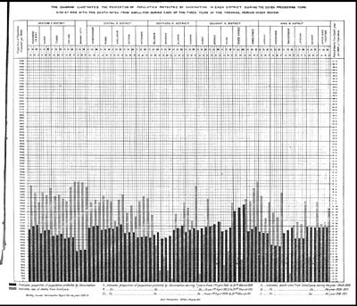
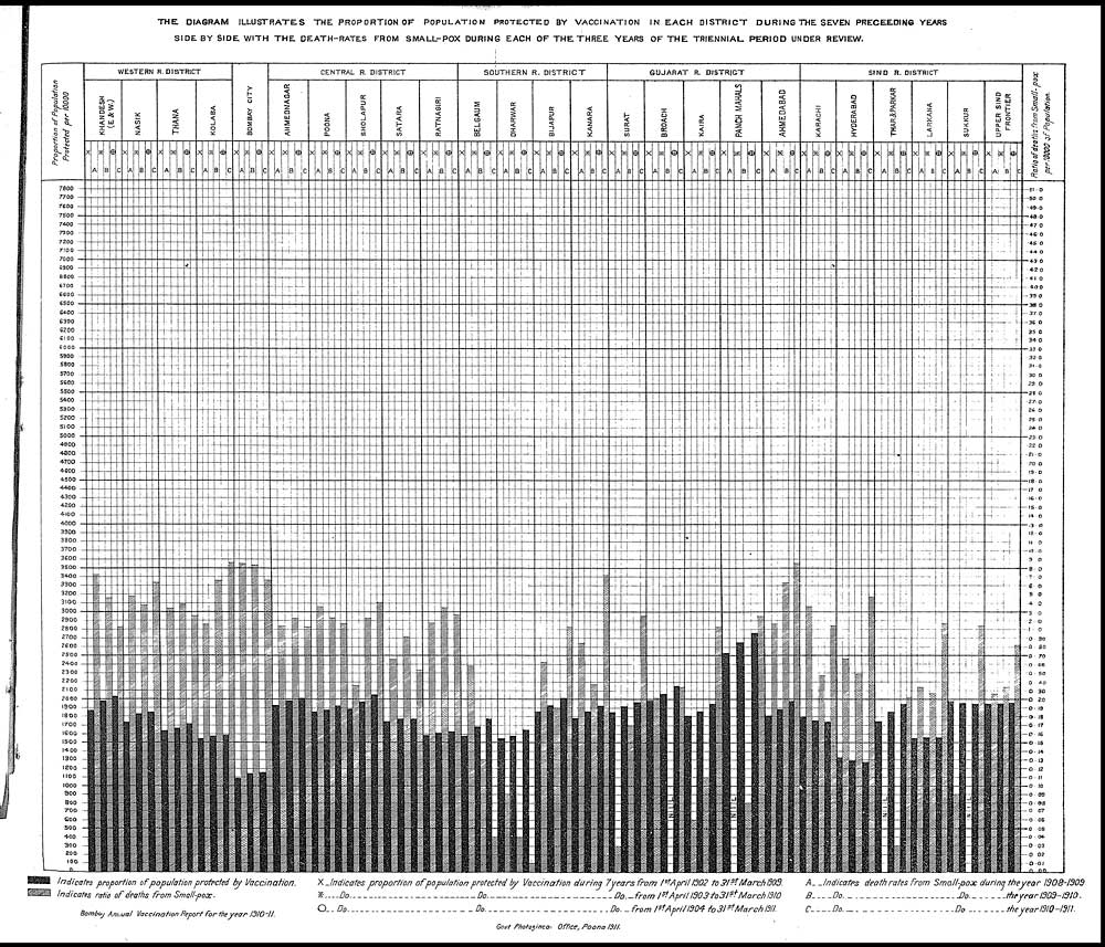
THE DIAGRAM ILLUSTRATES THE PROPORTION OF POPULATION PROTECTED BY VACCINATION IN EACH DISTRICT DURING THE SEVEN PRECEEDING YEARS
SIDE BY SIDE WITH THE DEATH-RATES FROM SMALL-POX DURING EACH OF THE THREE YEARS OF THE TRIENNIAL PERIOD UNDER REVIEW.
[NLS note: a graphic appears here - see image of page]
Set display mode to: Large image | Zoom image | Transcription
Images and transcriptions on this page, including medium image downloads, may be used under the Creative Commons Attribution 4.0 International Licence unless otherwise stated. ![]()
| Permanent URL | https://digital.nls.uk/91032587 |
|---|---|
| Description | Diagram illustrates the proportion of population protected by vaccination in each district during the seven preceeding years side by side with the death-rates from small-pox during each of the three years of the triennial period under review |
| Attribution and copyright: |
|
|---|
| Description | Covers 1899-1928. Details and appraises vaccination operations in the Bombay Presidency. Tables show particulars of vaccination. Success and mortality rates noted. |
|---|---|
| Shelfmark | IP/13/VA.3 |
| Additional NLS resources: | |
| Description | The Vaccination collection consists of 66 volumes dating from 1856 to 1933. Reports show how vaccination against smallpox was implemented in India. They reveal the shift from variolation, improved vaccination techniques, logistics of lymph supply, funding and staffing. They explore how the local population viewed and resisted western vaccination. |
|---|---|
| Description | The India Papers collection contains publications of the central (Imperial) Government and many Indian states. Most states came under British rule. Much of the collection dates from between the post-Mutiny re-organisation of the Indian Government and Indian Independence in 1947. Some items published in London by John Murray. |
|---|---|
| Shelfmark | India Papers |
| Additional NLS resources: | |