

Medicine - Vaccination > 1902-1928 - Report on vaccination in the United Provinces > Vaccination United Provinces of Agra and Oudh 1923-1928 > 1920-1923 - Triennial report on vaccination in the United Provinces of Agra and Oudh for the years 1920-21, 1921-22 and 1922-23
(26) Foldout open

Download files
Individual page:
Thumbnail gallery: Grid view | List view
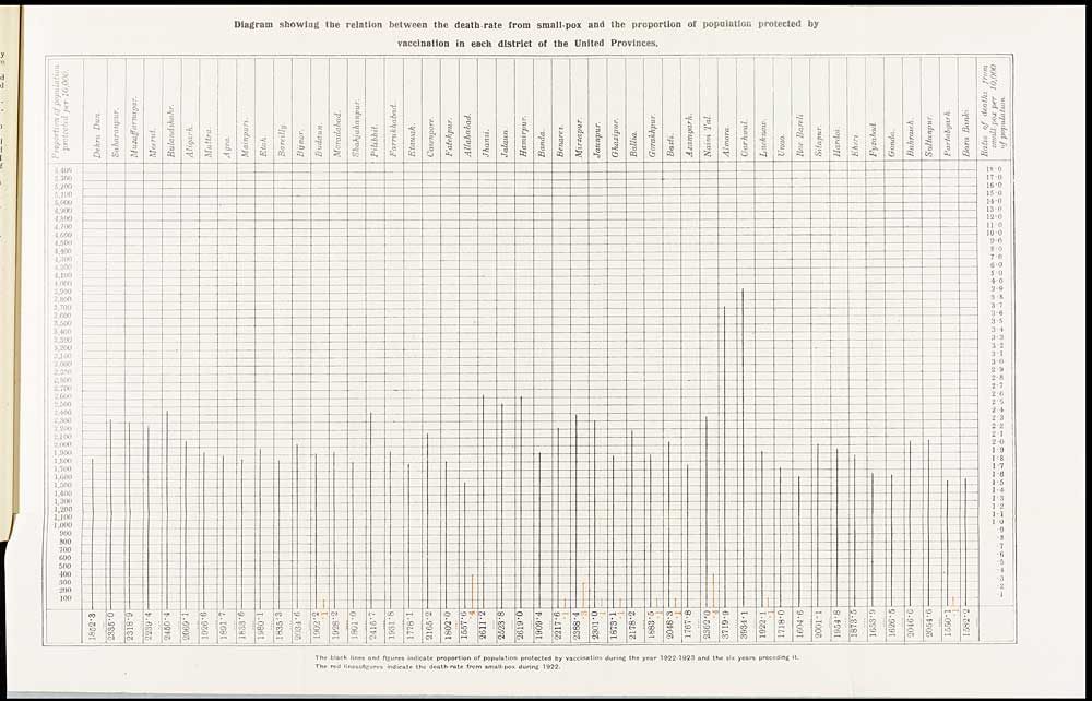
Diagram showing the relation between the death-rate from small-pox and the proportion of population protected by
vaccination in each district of the United Provinces.
[NLS note: a graphic appears here - see image of page]
The black lines and figures indicate proportion of population protected by vaccination during the year 1922-1923 and the six years preceding it.
The red lines & figures indicate the death-rate from small-pox during 1922.
Set display mode to: Large image | Zoom image | Transcription
Images and transcriptions on this page, including medium image downloads, may be used under the Creative Commons Attribution 4.0 International Licence unless otherwise stated. ![]()
| Permanent URL | https://digital.nls.uk/90512869 |
|---|---|
| Description | Diagram showing the relation between the death-rate from small-pox and the proportion of population protected by vaccination in each district of the United Provinces |
| Attribution and copyright: |
|
|---|
| Description | Covers 1902-1928. Details and appraises vaccination operations in the United Provinces of Agra and Oudh. Describes manufacture and storage of lymph. Tables show particulars of vaccination. Success and mortality rates noted. Colour diagrams included. |
|---|---|
| Shelfmark | IP/30/VA.3 |
| Additional NLS resources: | |
| Description | The Vaccination collection consists of 66 volumes dating from 1856 to 1933. Reports show how vaccination against smallpox was implemented in India. They reveal the shift from variolation, improved vaccination techniques, logistics of lymph supply, funding and staffing. They explore how the local population viewed and resisted western vaccination. |
|---|---|
| Description | The India Papers collection contains publications of the central (Imperial) Government and many Indian states. Most states came under British rule. Much of the collection dates from between the post-Mutiny re-organisation of the Indian Government and Indian Independence in 1947. Some items published in London by John Murray. |
|---|---|
| Shelfmark | India Papers |
| Additional NLS resources: | |