Medicine - Vaccination > 1902-1928 - Report on vaccination in the United Provinces > Vaccination United Provinces of Agra and Oudh 1914-1922 > 1914-1917 - Triennial report on vaccination in the United Provinces of Agra and Oudh for the years 1914-15, 1915-16 and 1916-17
(159) Foldout open
Download files
Individual page:
Thumbnail gallery: Grid view | List view

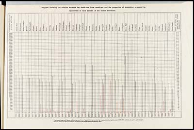
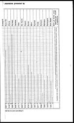
Diagram showing the relation between the death-rate from small-pox and the proportion of population protected by
vaccination in each district of the United Provinces.
The black lines and figures indicate proportion of population protected by vaccination during the year 1916-1917 and the six years preceding it.
The red lines and figures indicate the death-rate from small-pox during 1916.
Set display mode to: Large image | Zoom image | Transcription
Images and transcriptions on this page, including medium image downloads, may be used under the Creative Commons Attribution 4.0 International Licence unless otherwise stated. ![]()
| Attribution and copyright: |
|
|---|


