Medicine - Vaccination > 1902-1928 - Report on vaccination in the United Provinces > Vaccination United Provinces of Agra and Oudh 1902-1913 > Notes on vaccination in the United Provinces of Agra and Oudh for the year ending 31st March 1912
(441) Foldout open
Download files
Individual page:
Thumbnail gallery: Grid view | List view

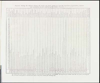
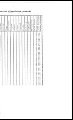
Diagram showing the relation between the death-rate from small-pox and the proportion, of population protected
by vaccination in each district of the United Provinces.
[NLS note: a graphic appears here - see image of page]
The black lines and figures indicate proportion of population protected by vaccination during the year 1911-12, and the six years preceding it.
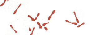
The red lines and figures indicate the death-rate from small-pox during 1911.
Set display mode to: Large image | Zoom image | Transcription
Images and transcriptions on this page, including medium image downloads, may be used under the Creative Commons Attribution 4.0 International Licence unless otherwise stated. ![]()
| Attribution and copyright: |
|
|---|


